Home and Mortgage Affordability background
The goal of these charts is to provide a simple illustration of homes in selected major UK cities that people working full time in 12 popular jobs could afford.
Back to infographic
We have combined three key sources of information to create them:
• ONS Annual Survey of Hours and Earnings
• Land Registry Paid Price Data
• reallymoving.com data & analysis
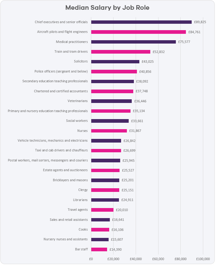
Chart 1: UK median 2017 salaries by job
Data from the ONS Annual Survey of Hours and Earnings Study of 2017 provides a median salary by job role.

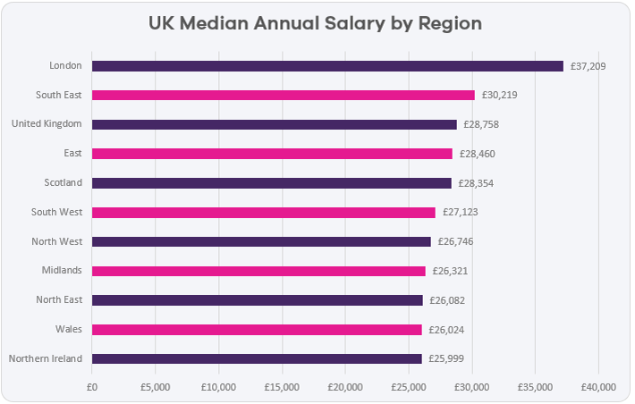
Chart 2: UK median salaries 2017 by region
The ONS Annual Survey of Hours and Earnings data also shows the median salary by region

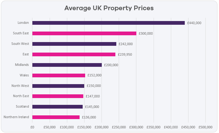
Chart 3: Average UK property prices 2017
Property prices are based on completed transactions in 2017 recorded in the Land Registry Paid Price data for residential property.

Take a look at our interactive Home and Mortgage Affordability infographic and find out what percentage of homes people can afford by job, UK salary and city.
These figures are correct as at April 2018.